

GREEN GIN: design for the Year of Dragon
Chinese traditions are getting more and more to the Western culture, while adapting to it. Based on this, we created a gin line design in the beginning of the Green Dragon year.
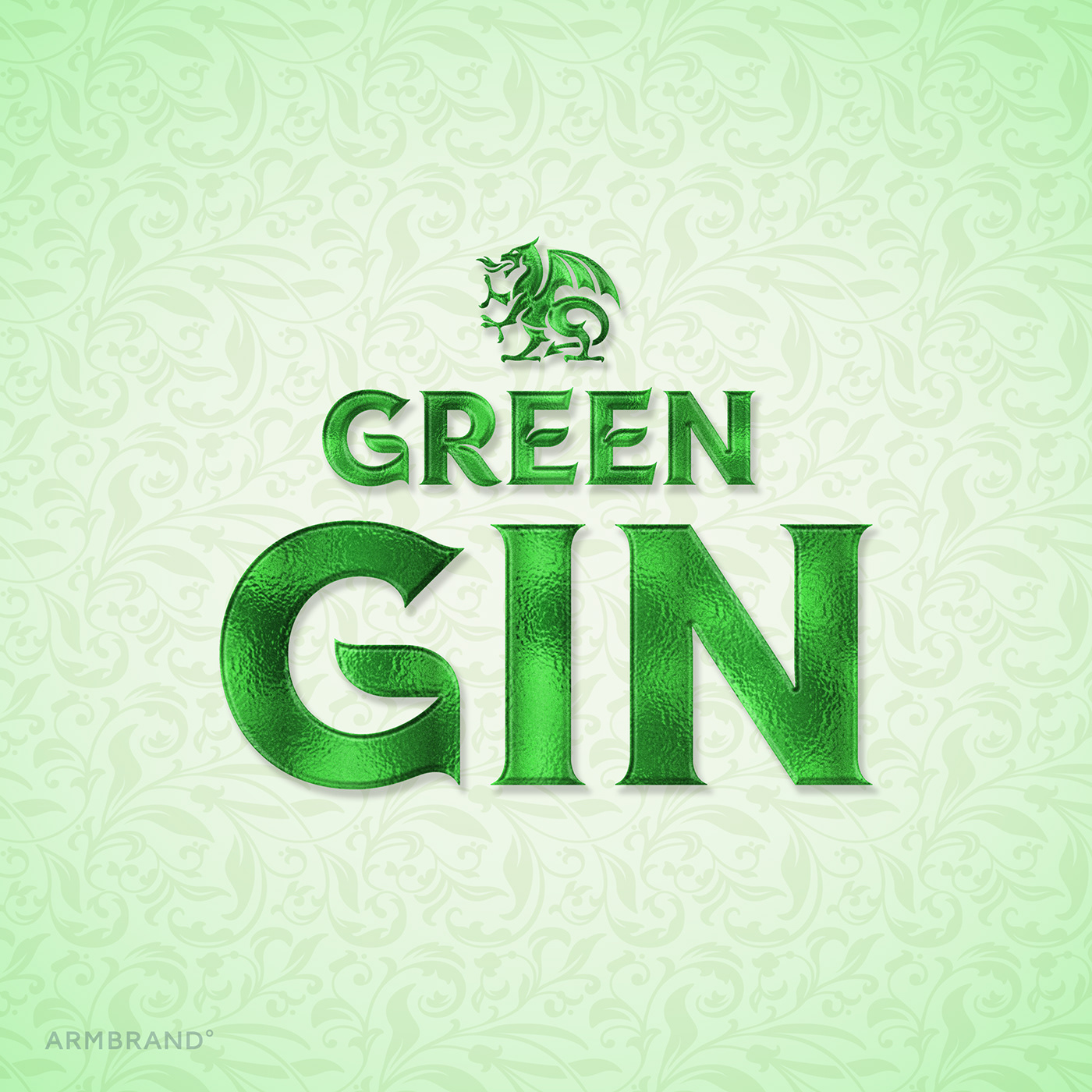
Lettering of the logo is made in the style of strong alcohol, which fits other design elements and supports the gin theme itself, combining modern fonts trends with uniqueness.
The label forms an integrated whole with voluminous plant embossment on the bottle, and rhymes with it through a classic Victorian pattern.
To save for the customers time the time for decisions making, we've made diversity in the series through noticeable and understandable color coding. Unique personal illustrations complete the balanced image.
As the result, there’s the actual gin line, noticeable on the shelf.


